 Aspire Budgeting
Trends report
Learn how to use Trends to compare category spending month by month and inspect the transactions behind a change.
Updated August 10, 2026
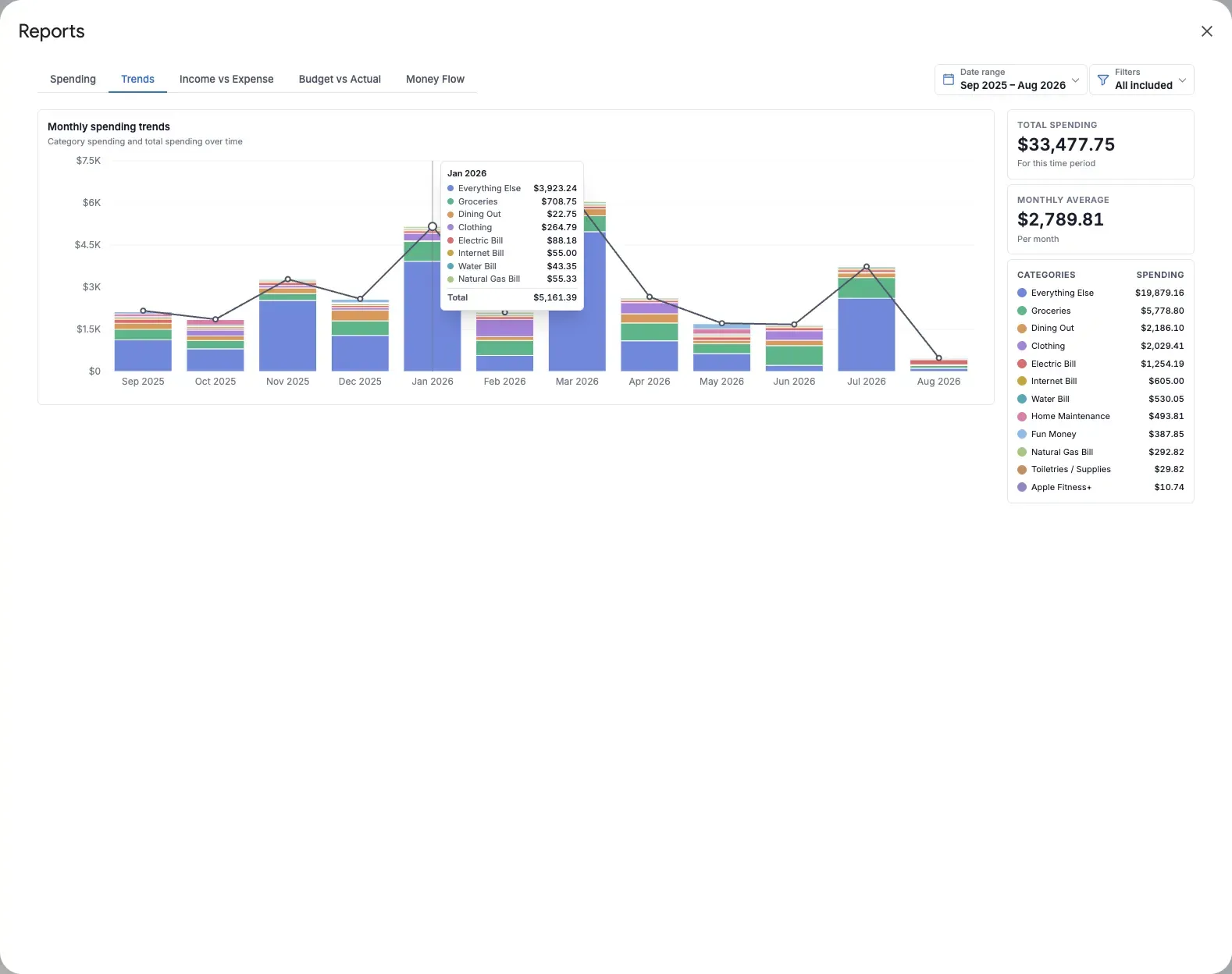
The Trends report answers: How is my spending changing from month to month? It displays one stacked bar per month, with each segment representing a category and a line showing total spending.
Use it to spot recurring patterns, lifestyle creep, seasonal expenses, and the effect of a change you made to your budget.
What the report shows
- Monthly stacked bars broken down by category
- A total-spending line across the same months
- Total spending for the selected period
- Average spending per month
- A category list showing each category’s period total
The bar segments explain which categories contributed to each month’s total. The line makes the overall direction easier to compare across months.
Focus on a category
Select a category in the list to emphasize it across the entire date range and open its transactions. Select a specific segment in the chart to narrow those transaction details to that category and month.
Close the transaction table to clear the selection and return to the complete chart.
How to read a trend
- The total line rises: Overall spending increased. Check which bar segments grew.
- One segment grows: That category is driving more of the monthly total.
- Bars vary but the line stays level: The mix of spending changed even though the total stayed similar.
- A single month spikes: Inspect that month’s segment before treating it as a lasting pattern.
Three months can show an early direction, but six to twelve months gives you a better view of seasonality and recurring changes.
Useful ways to use Trends
- Validate a cutback: Filter to a category and see whether spending actually declined after you changed your habits.
- Set a realistic target: Compare several months before deciding what a normal monthly amount looks like.
- Prepare for seasonal costs: Use a twelve-month range to find predictable peaks such as holidays, travel, or utilities.
- Find gradual growth: Review discretionary categories for increases that are too small to notice in any one month.
Tips
- Use the Spending report for a clearer composition view when you only care about one month.
- A category with no outflow in a month contributes zero to that month’s bar.
- The chart line represents total spending; selecting it does not open transactions because the category bar segments provide the actionable detail.
- Consistent transaction categorization makes trend comparisons more reliable.